

Nick Shore and Paul Bennett founded Nickandpaul on the belief that great branding emerges from the overlap of strategic insight and creative expression. The agency’s identity—two overlapping circles—visually captured this philosophy and informed every detail, from brand materials to spatial design..
Designed nickandpaul, NYC
STRATEGIC CREATIVE / CREATIVE STRATEGIC
The intersecting circles became a graphic shorthand for the agency’s integrated approach, which was applied to its visual identity and even the architecture of its Chelsea Market office.

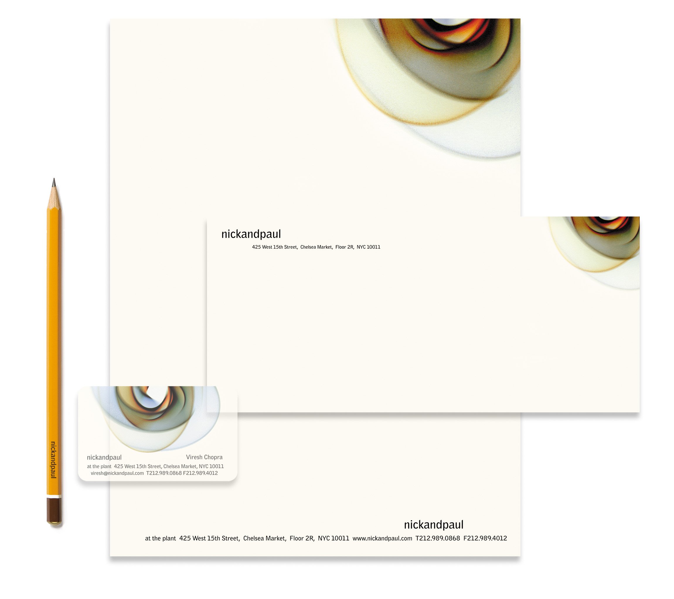
The office was housed in the former Nabisco factory—its raw infrastructure inspired everything from business cards to material choices.

A CURVED SPACE
Inspired by Richard Serra’s Torqued Ellipses, the office was divided into creative and strategy zones, joined by a central, collaborative space where disciplines met and ideas took shape.


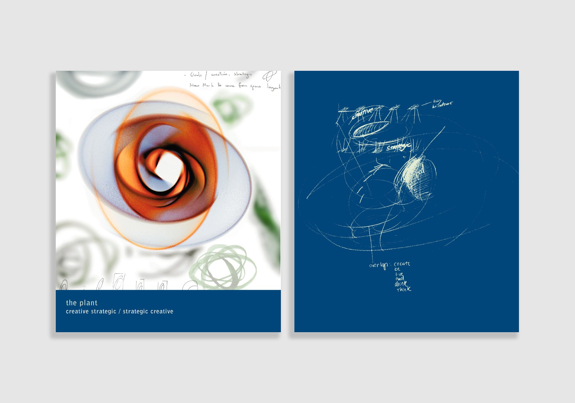


The brand’s design and layout embodied the overlap of strategy and creativity, visually and experientially.
-
Designed at
nickandpaul, NYC
-
Illustrations
Illustrations and Watercolors John Ebeling
-
Photography
Jim Cooper